Forecasting
Goal
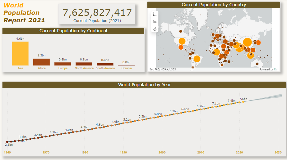
The goal of the exercise "Activity: Forecasting sales" is to leverage the forecasting feature in Microsoft Power BI to add predictive analysis to a line chart visualization. This feature allows users to create forecasts for global population trends using the provided Power BI report, WorldPopulation.pbix.
Add and Customize a Line Chart:
Insert a line chart visual. Add the Year column to the X-axis and the Population column to the Y-axis. Format the line chart to align with the existing visualizations in the report.
Enhance the Report with Forecasting:
Enable the forecasting feature in the Analytics pane. Configure the forecast settings to add a 10-year prediction with a 95% confidence interval.
Customize the Forecast Line:
Adjust the forecast line's color and transparency. Modify the confidence band settings to improve visibility. Update the tooltip title for clarity.
Result
The outcome of this exercise is a Power BI report that includes a customized line chart with a forecasting line. This enhanced visualization provides a projection of the world population over the next 10 years, adding significant predictive insight to the analysis. By completing this exercise, you gain practical experience in using Power BI's forecasting capabilities to create informative and visually appealing predictive analyses. This allows for better decision-making and strategic planning based on projected data trends.